The year is 2013.
Side Car is one of our major competitors and almost no one outside of San Francisco has heard of ride-sharing, much less "Your Friend with a Car".
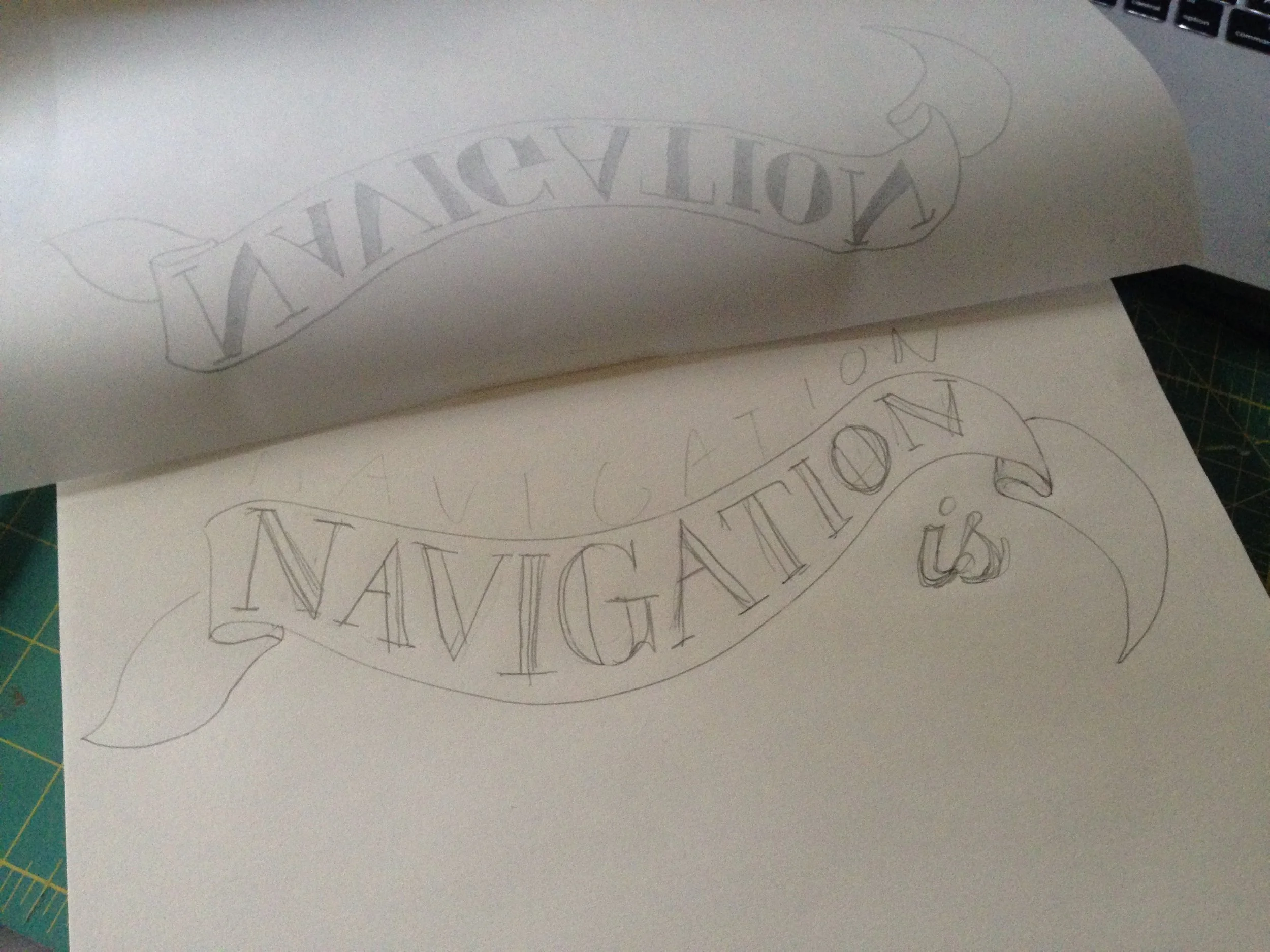
In contrast to “Everyone’s Private Driver” at Uber, we are the crunchy, friendly, human, driver-loving ones in minty green with the pink mustache. I reveled in hand drawn type and humanistic illustration.
It was the wild west and absolutely everything was up for grabs. We were all kraft paper, texture, and love.
DESIGN: Meghan Newell. MOTION: Meghan Newell & Mark Teater
Lyft Brand Reel 2013-2014:
A personal and poignant collection of my work during my first year at Lyft - the times they were a-changing!
Initially brought in to work on the Lyft Explainer, I was asked to stay and help them develop their brand. My background in motion and obsession with hand drawn typography became a foundation of this first phase.
As Senior Designer, I managed four designers and reported to the Head of Brand. I developed our first email templates, designed much of our marketing site, and spent a lot of time on our many video assets including promos and training videos.
Shared ride branding concepts
Email templates
Motion graphics
Process began with a sketch and ended in animation
“It sends the message that getting a ride from someone you’ve never met is safe and fun. And nothing like hitchhiking.”
Strange to look back on how whacky a tech company could be, but it was an important phase. Though hard to remember now, convincing people to get in cars with a random stranger in a Corolla was a big leap! The rituals and silliness helped make us relatable and prove out the category.
We all know this evolved. And I was lucky enough to be a part of it – it doesn’t get boring in house when you are a new company every year for 5 years!
Check out the next evolution: Lyft phase 2 (2015-2016).


